This week I focused on color/texture and typography on the 2 narrowed down pie packages. I’m not sure which I like better at this point but I think both designs are a dramatic change from the traditional package.


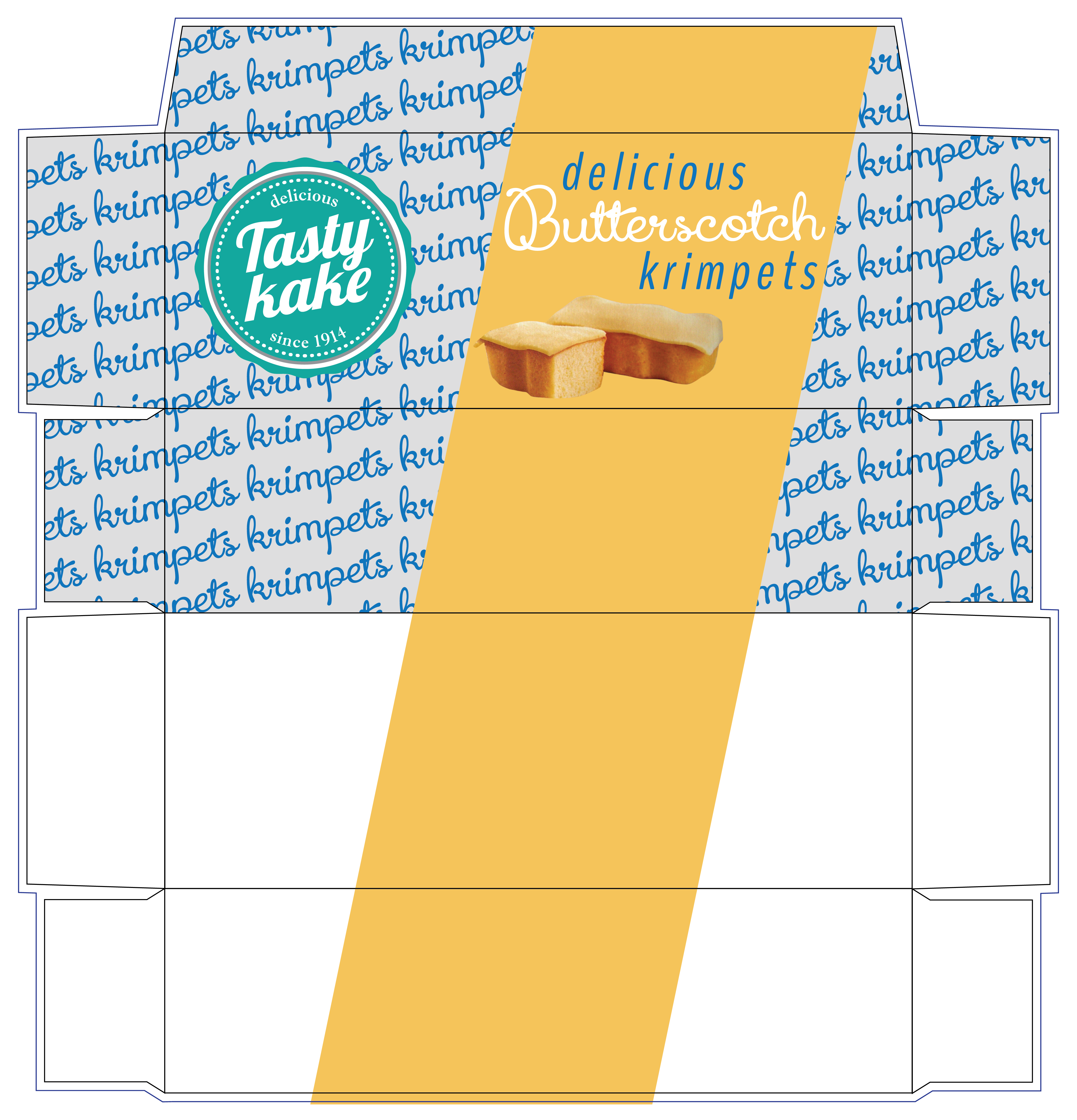
At this point I also thought it best to move forward with the Krimpet package as well to see which of the above styles would translate best into the box format. I think these need some more work but as a general idea of layout I found it to be helpful. I feel like the layout with the craft paper texture is working better at the moment in this layout.

On top of having too much fun with packaging layouts this week, I posted the new logo to my Facebook and got a great deal of feedback. I found the most common remarks to be not to break up the word ‘Tastykake’ and the color. It was a love or hate. check out the screen shot of the post below. I can’t wait to post the package redesigns.
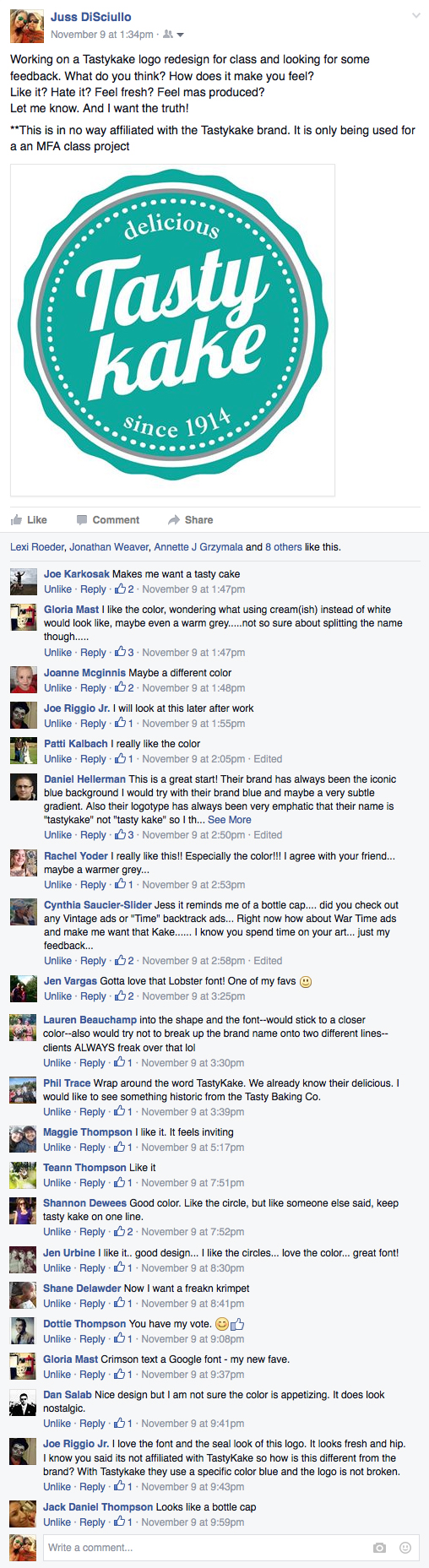

Wowee what a difference in design when you go to recycled paper packaging and the more contemporary approach to type design (ya gotta love that Rockwell.) I really like it. As for the FB “voting” on the Tastykake name in one line… that’s a concern. Worth a discussion tomorrow with the class?
LikeLike